6. CSS Layout#
6.1. The display Property#
The
displayproperty is used to specify how an element is shown on a web page.Every HTML element has a default
displayvalue, depending on what type of element it is. The default display value for most elements isblockorinline.Value
Description
inlineDisplays an element as an inline element
blockDisplays an element as a block element
contentsMakes the container disappear, making the child elements children of the element the next level up in the DOM
flexDisplays an element as a block-level flex container
gridDisplays an element as a block-level grid container
inline-blockDisplays an element as an inline-level block container. The element itself is formatted as an inline element, but you can apply height and width values
inline-flexDisplays an element as an inline-level flex container
inline-gridDisplays an element as an inline-level grid container
inline-tableThe element is displayed as an inline-level table
list-itemLet the element behave like a
<li>elementrun-inDisplays an element as either block or inline, depending on context
tableLet the element behave like a
<table>elementtable-captionLet the element behave like a
<caption>elementtable-column-groupLet the element behave like a
<colgroup>elementtable-header-groupLet the element behave like a
<thead>elementtable-footer-groupLet the element behave like a
<tfoot>elementtable-row-groupLet the element behave like a
<tbody>elementtable-cellLet the element behave like a
<td>elementtable-columnLet the element behave like a
<col>elementtable-rowLet the element behave like a
<tr>elementnoneThe element is completely removed
initialSets this property to its default value
inheritInherits this property from its parent element
6.1.1. Block-level Elements#
A block-level element ALWAYS starts on a new line and takes up the full width available (stretches out to the left and right as far as it can).
Examples of block-level elements:
<div><h1>-<h6><p><form><header><footer><section>
6.1.2. Inline Elements#
An inline element DOES NOT start on a new line and** only takes up as much width as necessary**.
Examples of inline elements:
<span><a><img>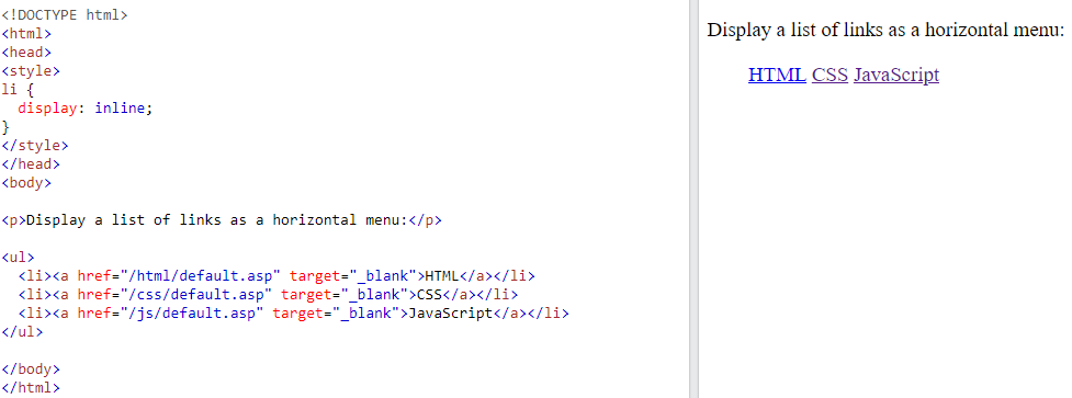
6.1.3. Display: none#
display: none; is commonly used withJavaScriptto hide and show elements without deleting and recreating them.The
<script>element usesdisplay: none;as default.visibility:hidden;also hides an element. However, the element will still take up the same space as before. The element will be hidden, but still affect the layout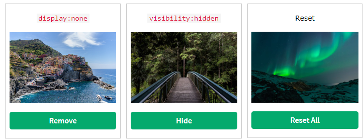
6.2. width and max-width#
Setting the
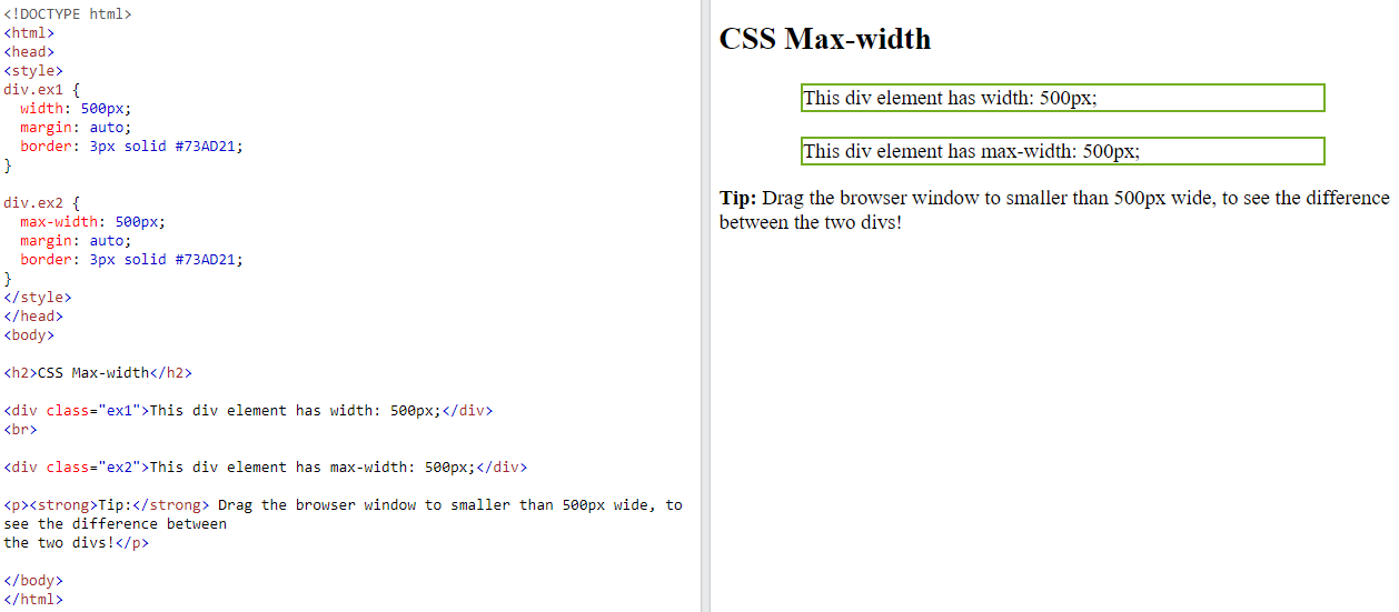
widthof ablock-level elementwill prevent it from stretching out to the edges of its container.Then, you can set the
marginstoauto, to horizontally center the element within its container.The element will take up the specified
width, and the remaining space will be split equally between the two margins
The problem with the
<div>above occurs when the browser window is smaller than the width of the element. The browser then adds a horizontal scrollbar to the page.
Using
max-widthinstead, in this situation, will improve the browser’s handling of small windows. This is important when making a site usable on small devices:
Example
6.3. The position Property#
The
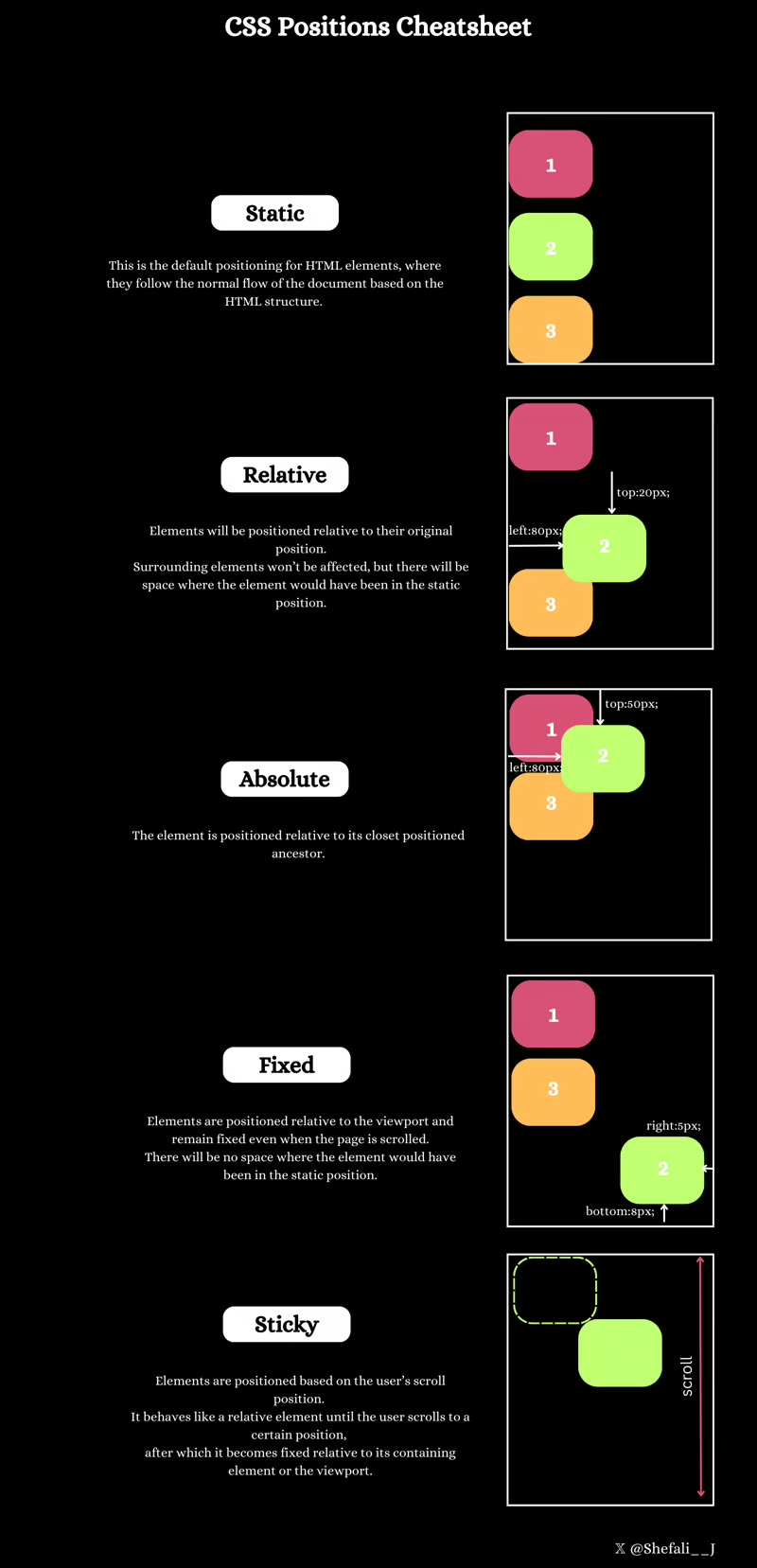
positionproperty specifies the type of positioning method used for an element.
There are five different position values:
staticrelativefixedabsolutesticky
Elements are then positioned using the top, bottom, left, and right properties. However, these properties will not work unless the position property is set first. They also work differently depending on the position value.
6.3.1. position: static#
HTML elements are positioned static by default.
Static positioned elementsare not affected by the top, bottom, left, and right properties.Example
div.static {
position: static;
border: 3px solid #73AD21;
}
6.3.2. position: relative#
An element with
position: relative;is positioned relative to its normal position.Setting the top, right, bottom, and left properties of a relatively-positioned element will cause it to be adjusted away from its normal position. Other content will not be adjusted to fit into any gap left by the element.
Example
div.relative {
position: relative;
left: 30px;
border: 3px solid #73AD21;
}
6.3.3. position: fixed; and position: absolute;#
An element with
position: fixed;is positioned relative to the viewport, which means it always stays in the same place even if the page is scrolled. The top, right, bottom, and left properties are used to position the element.Common Use Cases: Used for elements that need to stay in a fixed position on the screen, such as navigation bars, headers, or footers.
Example
div.fixed {
position: fixed;
bottom: 0;
right: 0;
width: 300px;
border: 3px solid #73AD21;
}
Property
position: absoluteposition: fixedPosition Context
Relative to the nearest positioned ancestor or initial containing block.
Relative to the viewport.
Scrolling Behavior
Scrolls with the document.
Stays fixed in the same position.
Common Use Cases
Placing elements at specific coordinates within a container.
Fixed headers, footers, or sidebars.
Example
<div class="container"><div class="absolute-box">Absolute</div></div><div class="fixed-box">Fixed</div>An element with
position: absolute;is positioned relative to the nearest positioned ancestor (instead of positioned relative to the viewport, like fixed).Common Use Cases: Used to create elements that are placed at specific coordinates within their containing block.
Example
div.relative {
position: relative;
width: 400px;
height: 200px;
border: 3px solid #73AD21;
}

div.absolute {
position: absolute;
top: 80px;
right: 0;
width: 200px;
height: 100px;
border: 3px solid #73AD21;
}
6.4. Overflow#
The
overflowproperty specifies whether toclipthe content or to addscrollbarswhen the content of an element is too big to fit in the specified area.The
overflowproperty has the following values:visible- Default. The overflow is not clipped. The content renders outside the element’s boxhidden- The overflow is clipped, and the rest of the content will be invisiblescroll- The overflow is clipped, and ascrollbaris added to see the rest of the contentauto- Similar toscroll, but it adds scrollbars only when necessary
6.4.1. overflow: visible#
By default, the
overflowisvisible, meaning that it is not clipped and it renders outside the element’s box: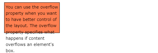
Example
div {
width: 200px;
height: 65px;
background-color: coral;
overflow: visible;
}
6.4.3. overflow: scroll#
Setting the value to
scroll, theoverflowis clipped and ascrollbaris added to scroll inside the box. Note that this will add a scrollbar both horizontally and vertically (even if you do not need it):
Example
div {
overflow: scroll;
}
6.4.4. overflow: auto#
The
autovalue is similar toscroll, but it addsscrollbarsonly when necessary:
Example
div {
overflow: auto;
}
6.5. The z-index Property#
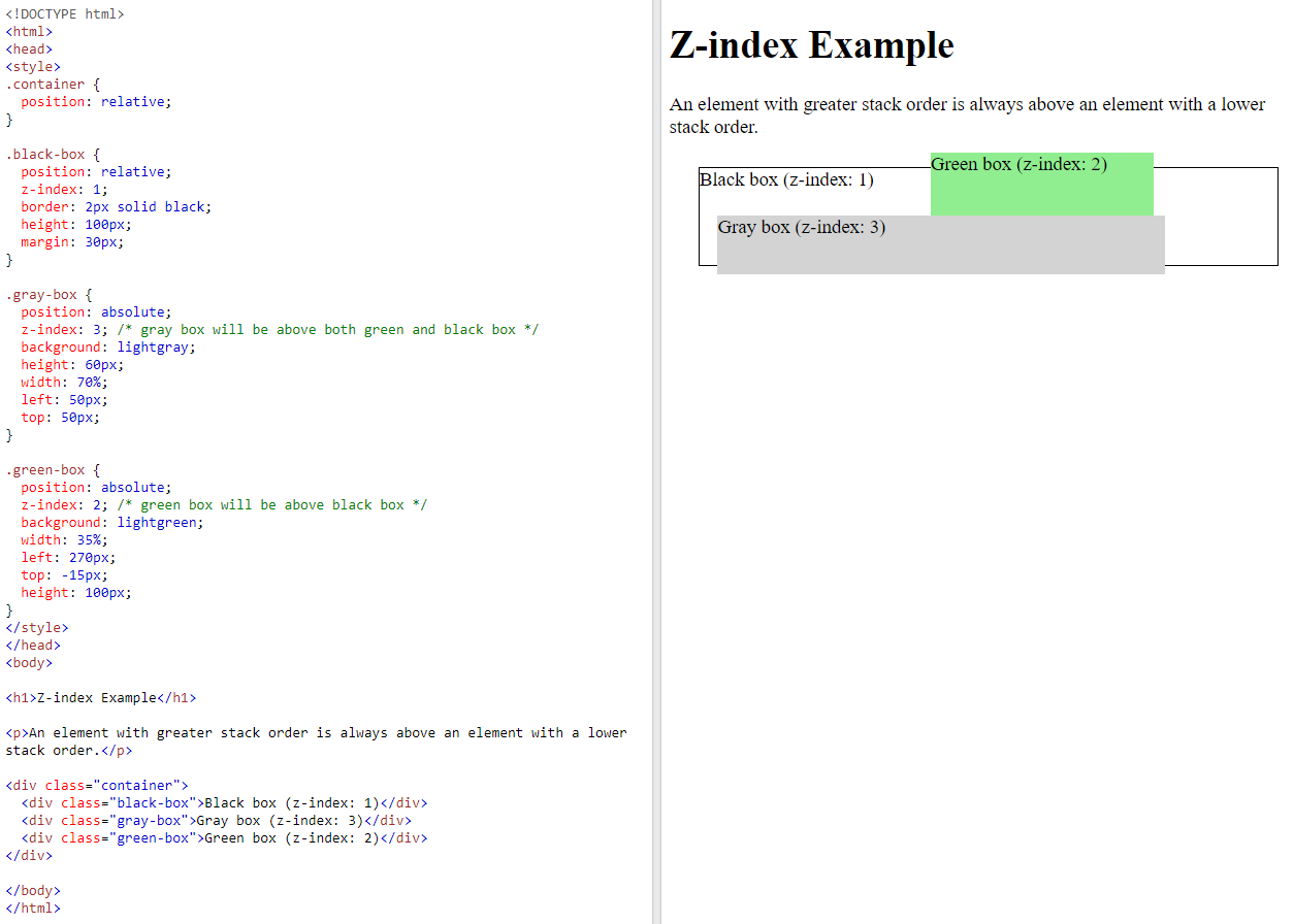
When elements are positioned, they can overlap other elements. The
z-indexproperty specifies the stack order of an element (which element should be placed in front of, or behind, the others).Example
img {
position: absolute;
left: 0px;
top: 0px;
z-index: -1;
}
6.6. float and clear#
The CSS
floatproperty specifies how an element should float.The CSS
clearproperty specifies what elements can float beside the cleared element and on which side.
6.6.1. The float Property#
The
floatproperty is used for positioning and formatting content e.g. let an image float left to the text in a container.The
floatproperty can have one of the following values:left- The element floats to the left of its containerright- The element floats to the right of its containernone- The element does not float (will be displayed just where it occurs in the text). This is defaultinherit- The element inherits the float value of its parent
Example
<style>
img {
float: right;
}
</style>
</head>
<body>

<h2>Float Right</h2>

<p>In this example, the image will float to the right in the paragraph, and the text in the paragraph will wrap around the image.</p>

<p><img src="pineapple.jpg" alt="Pineapple" style="width:170px;height:170px;margin-left:15px;">
Lorem ipsum dolor sit amet, consectetur adipiscing elit. Phasellus imperdiet, nulla et dictum interdum, nisi lorem egestas odio, vitae scelerisque enim ligula venenatis dolor. Maecenas nisl est, ultrices nec congue eget, auctor vitae massa. Fusce luctus vestibulum augue ut aliquet. Mauris ante ligula, facilisis sed ornare eu, lobortis in odio. Praesent convallis urna a lacus interdum ut hendrerit risus congue. Nunc sagittis dictum nisi, sed ullamcorper ipsum dignissim ac. In at libero sed nunc venenatis imperdiet sed ornare turpis. Donec vitae dui eget tellus gravida venenatis. Integer fringilla congue eros non fermentum. Sed dapibus pulvinar nibh tempor porta. Cras ac leo purus. Mauris quis diam velit.</p>

</body>

6.6.2. Float Examples#
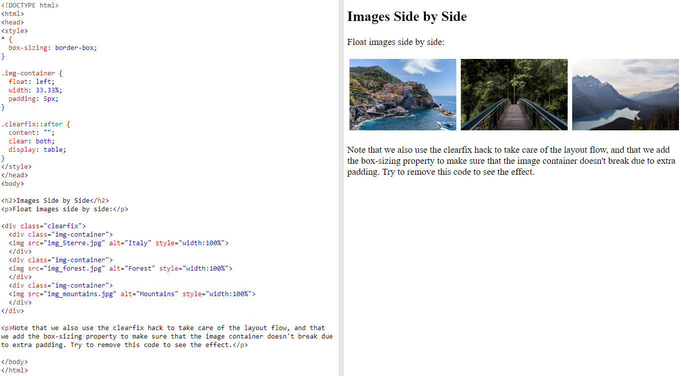
With the
floatproperty, it is easy to float boxes of content side by side:Example
* {
box-sizing: border-box;
}

.box {
float: left;
width: 33.33%; /* three boxes (use 25% for four, and 50% for two, etc) */
padding: 50px; /* if you want space between the images */
}

6.6.3. The clear Property#
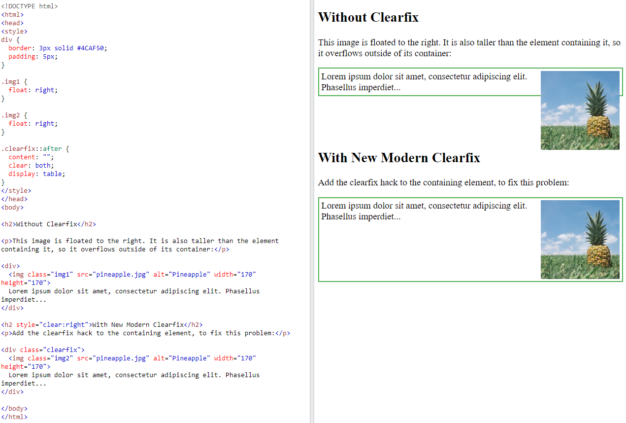
When we use the
floatproperty, and we want the next element below (not on right or left), we will have to use theclearproperty.The
clearproperty specifies what should happen with the element that is next to afloatingelement.The clear property can have one of the following values:
none- The element is not pushed below left or right floated elements. This is defaultleft- The element is pushed below left floated elementsright- The element is pushed below right floated elementsboth- The element is pushed below both left and right floated elementsinherit- The element inherits the clear value from its parent
6.6.4. Float Example with clearfix#
6.7. Task#
6.7.1. Objective:#
Understand and apply CSS layout properties including display, position, overflow, float, and clear to create a well-structured and responsive webpage layout.
6.7.2. Set Up the HTML Structure:#
Create a simple HTML file with the following structure:
<!DOCTYPE html>
<html lang="en">

<head>
    <meta charset="UTF-8">
    <meta name="viewport" content="width=device-width, initial-scale=1.0">
    <title>CSS Layout Task</title>
    <link rel="stylesheet" href="./03-layout.css">
</head>

<body>
    <header class="header">Header</header>
    <nav class="nav">
        <ul>
            <li><a href="#">Home</a></li>
            <li><a href="#">About</a></li>
            <li><a href="#">Services</a></li>
            <li><a href="#">Contact</a></li>
            <li><a href="#">Blog</a></li>
        </ul>
    </nav>
    <main class="main">
        <section class="content">Main Content</section>
        <aside class="sidebar">Sidebar</aside>
    </main>

    <div class="container clearfix">
        <div class="float-box">Float 1</div>
        <div class="float-box">Float 2</div>
        <div class="float-box">Float 3</div>
        <div class="float-box">Float 4</div>
        <div style="clear: both;"></div> <!-- Clear float -->
        <p>This text is after the floated boxes. It is cleared so it won't wrap around the floated elements.</p>
    </div>

    <footer class="footer">Footer</footer>
</body>

</html>
6.7.3. Style the Layout Using CSS Properties:#
Use the
display,position,overflow,float, andclearproperties to style the layout.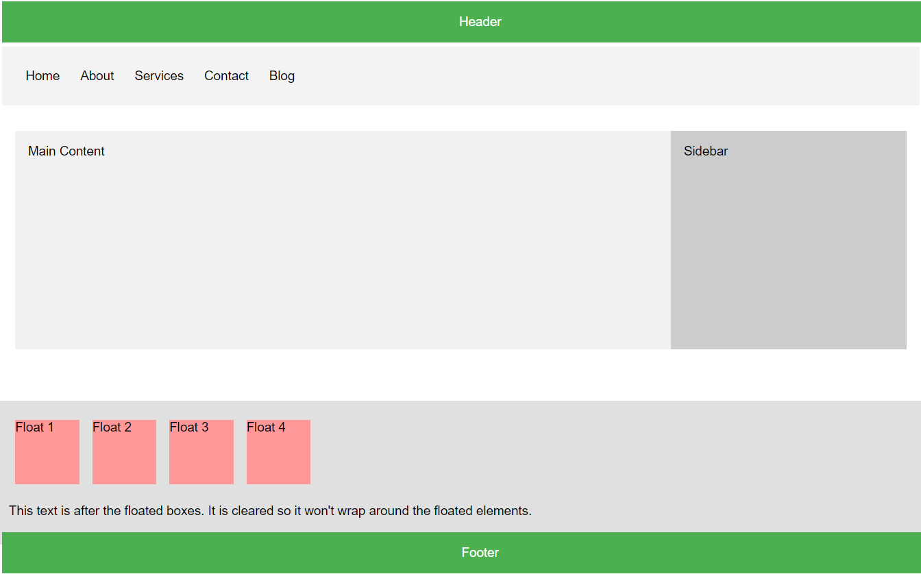
6.7.4. Sample Script#
/* Basic styles */
body {
    font-family: Arial, sans-serif;
    margin: 0;
    padding: 0;
    box-sizing: border-box;
}

header, nav, main, footer {
    padding: 20px;
    margin: 10px;
}

.header {
    background-color: #4CAF50;
    color: white;
    text-align: center;
    position: fixed;
    width: 100%;
    top: 0;
    left: 0;
    z-index: 1000; /* Ensure it stays on top of other elements */
}

.nav {
    background-color: #f3f3f3;
    overflow: auto;
    margin-top: 80px; /* Adjust for fixed header height */
}

.nav ul {
    list-style-type: none;
    margin: 0;
    padding: 0;
    overflow: hidden;
}

.nav ul li {
    float: left;
}

.nav ul li a {
    display: block;
    color: black;
    text-align: center;
    padding: 14px 16px;
    text-decoration: none;
}

.nav ul li a:hover {
    background-color: #ddd;
}

.main {
    display: flex;
    flex-wrap: wrap;
    margin-top: 20px; /* Adjust for fixed header and nav */
}

.content {
    flex: 3;
    background-color: #f1f1f1;
    padding: 20px;
}

.sidebar {
    flex: 1;
    background-color: #ccc;
    padding: 20px;
}

.footer {
    background-color: #4CAF50;
    color: white;
    text-align: center;
    clear: both;
    position: fixed;
    width: 100%;
    bottom: 0;
    left: 0;
}

main {
    margin-top: 80px; /* Adjust for fixed header */
    margin-bottom: 60px; /* Adjust for fixed footer */
}

.sidebar {
    overflow: auto; /* Ensures sidebar content is scrollable */
    height: 300px; /* Fixed height for demonstration */
}

/* Float and Clear examples */
.float-box {
    float: left;
    width: 100px;
    height: 100px;
    margin: 10px;
    background-color: #ff9999;
}

.clearfix::after {
    content: "";
    display: table;
    clear: both;
}

.container {
    background-color: #e0e0e0;
    padding: 20px;
    margin-top: 20px;
}
6.8. Position Cheating sheet#
