1. Covariance and Covariance Matrix#
1.1. Covariance#
1.1.1. Understand Covariance#
Each pair of points \((x_i,y_i)\), \((x_j,y_j)\) in that plot determines a
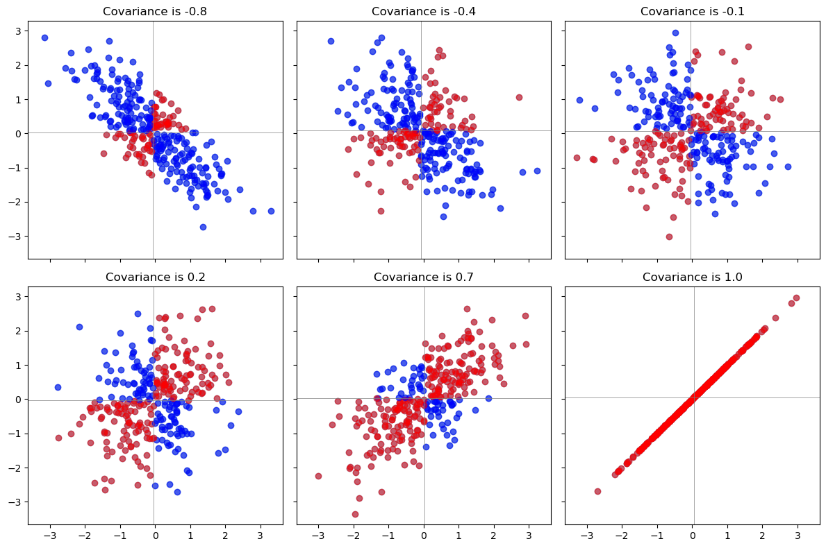
rectangle: it’s the smallest rectangle, whose sides are parallel to the axes, containing those points.Draw all possible such rectangles. Color them transparently, making the positive rectangles red (say) and the negative rectangles “anti-red” (blue). In this fashion, wherever rectangles overlap, their colors are either enhanced when they are the same (blue and blue or red and red) or cancel out when they are different.

The covariance is the net amount of red in the plot (treating blue as negative values).
Here are some examples with 32 binormal points drawn from distributions with the given covariances, ordered from most negative (bluest) to most positive (reddest).

1.1.2. Other Geometric Interpretation of Covariance#
Scatter Plot Representation
If two variables are positively correlated, the points tend to lie along a line sloping upwards. This indicates that as one variable increases, the other tends to increase as well.
Ellipse of Concentration
If you draw an ellipse around the scatter plot such that it encloses most of the points, the major axis of the ellipse indicates the direction of the strongest correlation.
Angle Between Variable Vectors (\(cos\) is as same as \(\rho\))
Considering each variable as a vector in a high-dimensional space, where each observation is a component of the vector.
The cosine of the angle between these two vectors is proportional to their correlation. If the angle is acute (less than 90 degrees), the cosine is positive, reflecting a positive correlation. If the angle is obtuse (greater than 90 degrees), the cosine is negative, indicating a negative correlation.
Vector Projection
A longer projection length indicates a stronger relationship (either positive or negative), while a shorter length indicates a weaker relationship.
import matplotlib.pyplot as plt
import numpy as np
# Function to generate data with the specified covariance matrix
def generate_data_with_covariance(cov):
    mean = [0, 0]
    # Ensure the covariance matrix is positive semi-definite
    cov = np.array(cov)
    eigvals, _ = np.linalg.eigh(cov)
    if np.any(eigvals < 0):
        # Set any small negative eigenvalues to zero
        cov = cov + np.eye(cov.shape[0]) * (-np.min(eigvals) + 1e-10)
    data = np.random.multivariate_normal(mean, cov, size=300)
    return data[:, 0], data[:, 1]

# Function to plot the scatter plot with color-coded shading
def plot_scatter_with_shading(ax, x, y, title, color_positive, color_negative):
    # Calculate covariance
    cov = np.cov(x, y)[0, 1]

    # Scatter plot
    ax.scatter(x, y, alpha=0.5)

    # Shading logic
    for i in range(len(x)):
        if x[i] > np.mean(x) and y[i] > np.mean(y):
            ax.scatter(x[i], y[i], color=color_positive, alpha=0.5)
        elif x[i] < np.mean(x) and y[i] < np.mean(y):
            ax.scatter(x[i], y[i], color=color_positive, alpha=0.5)
        elif (x[i] > np.mean(x) and y[i] < np.mean(y)) or (x[i] < np.mean(x) and y[i] > np.mean(y)):
            ax.scatter(x[i], y[i], color=color_negative, alpha=0.5)

    # Titles and labels
    ax.set_title(f'{title} {cov:.1f}')
    ax.axhline(np.mean(y), color='grey', lw=0.5)
    ax.axvline(np.mean(x), color='grey', lw=0.5)

# Create figure and axes
fig, axs = plt.subplots(2, 3, figsize=(12, 8), sharex=True, sharey=True)

# Flatten the array of axes for easy iteration
axs = axs.flatten()

# Covariance matrices for each subplot
cov_matrices = [
    [[1, -.8], [-.8, 1]],
    [[1, -.4], [-.4, 1]],
    [[1, 0], [0, 1]],
    [[1, .2], [.2, 1]],
    [[1, .7], [.7, 1]],
    [[1, 1], [1, 1]],  # Additional covariance matrix for the 6th plot
]

# Plot each scatter plot
for ax, cov in zip(axs, cov_matrices):
    x, y = generate_data_with_covariance(cov)
    plot_scatter_with_shading(ax, x, y, "Covariance is", 'red', 'blue')

# Adjust layout
plt.tight_layout()
plt.show()

1.1.3. Properties of Covariance#
Bilinearity: Because the amount of red depends on the size of the plot, covariance is directly proportional to the scale on the x-axis and to the scale on the y-axis. (Not normalized by scale)
Correlation. Covariance increases as the points approximate an upward sloping line and decreases as the points approximate a downward sloping line.
Sensitivity to outliers. A geometric outlier (one point standing away from the mass) will create many large rectangles in association with all the other points.
1.2. Covariance Matrix#
A covariance matrix is a mathematical concept that captures the variance of each variable and the covariance between variables in a dataset.

1.2.1. Importance in Statistical Analysis#
Measure of Correlation: The covariance matrix is essential for understanding the linear relationship between variables.
Multivariate Normal Distribution: In the context of multivariate normal distributions, the covariance matrix characterizes the shape, orientation, and scale of the distribution.
Dimensionality Reduction: Covariance matrices are used in
principal component analysis (PCA)andfactor analysis, which are techniques for dimensionality reduction and feature extraction.
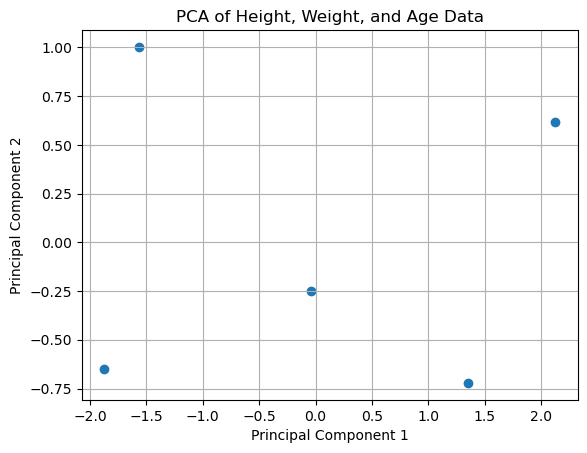
1.2.2. Example of PCA#
from sklearn.decomposition import PCA
# Example dataset with height (cm), weight (kg), and age (years)
data = np.array([
    [180, 80, 30],
    [174, 72, 28],
    [168, 60, 26],
    [181, 70, 32],
    [172, 68, 24],
    # Add more data as needed
])

# Standardize the data
data_standardized = (data - np.mean(data, axis=0)) / np.std(data, axis=0)

# Create a PCA instance and fit the standardized data
pca = PCA(n_components=2)  # Reduce to 2 components for visualization
pca.fit(data_standardized)

# Transform the data
transformed_data = pca.transform(data_standardized)

# Plot the first two principal components
plt.scatter(transformed_data[:, 0], transformed_data[:, 1])
plt.xlabel('Principal Component 1')
plt.ylabel('Principal Component 2')
plt.title('PCA of Height, Weight, and Age Data')
plt.grid(True)
plt.show()

# Print the variance explained by each component
print("Variance explained by each component:", pca.explained_variance_ratio_)

Variance explained by each component: [0.820137 0.15933251]


